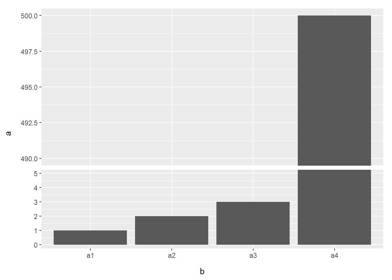
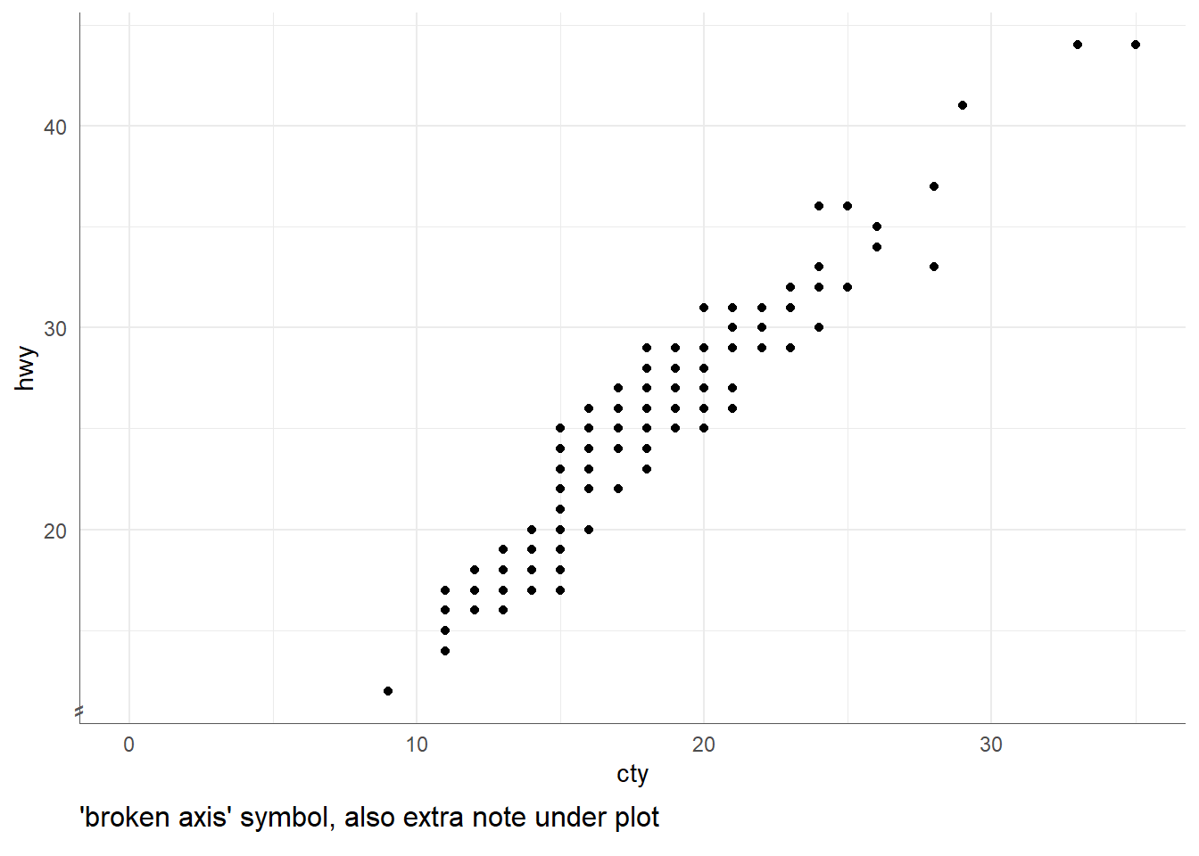
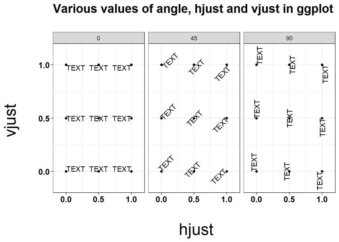
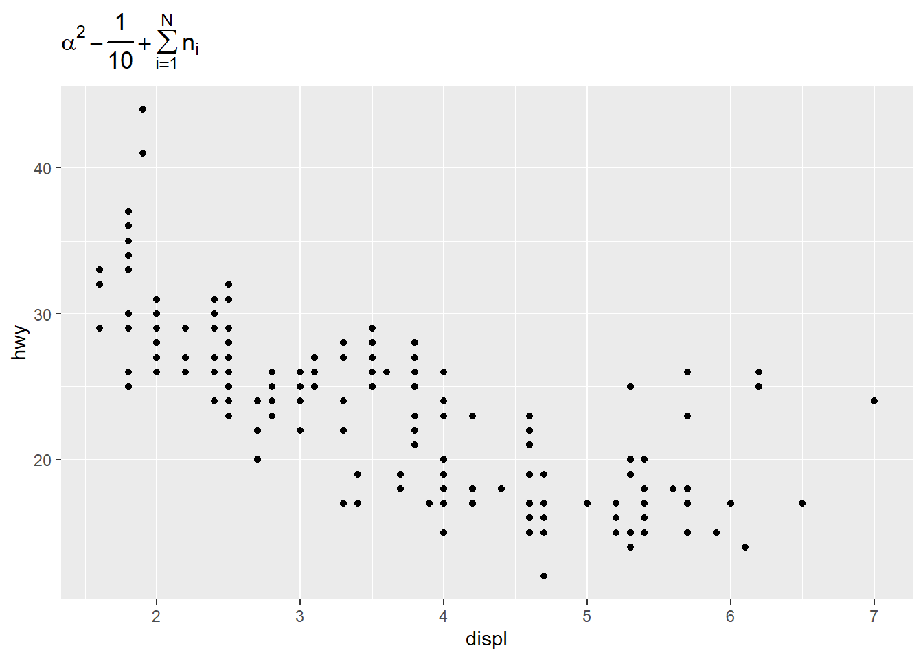
The one time I’ve done this is to add a axis break symbol for when the y axis does not start at zero. In addition to adding the symbol, you also have to set the ggplotGrob to not clip items outside the plot panel.
base <- mpg %>%ggplot(aes(x = cty, y = hwy)) +geom_point() +lims(x =c(0, NA)) +theme_minimal() +theme(axis.line =element_line(color ="grey35", size =0.25))
Warning: The `size` argument of `element_line()` is deprecated as of ggplot2 3.4.0.
ℹ Please use the `linewidth` argument instead.
p.zoomin <- base +annotate("text" , x =-Inf, y =-Inf#bottom left corner of plot , label ="\u2e17"#symbol ⸗ (diag double hyphen) , color ="grey35"#same color as axis.line , size =4.5#adjust based on out plot size , vjust =-0.25#adjust further up ) #get grob instructions g.zoomin <-ggplotGrob(p.zoomin) #turn panel clipping off g.zoomin$layout$clip[g.zoomin$layout$name =="panel"] ="off"#draw final cowplot::ggdraw( cowplot::add_sub( g.zoomin , "'broken axis' symbol, also extra note under plot" , size =12 , x =0 , hjust =0#, y = 1.25 #same line as x axis title ))
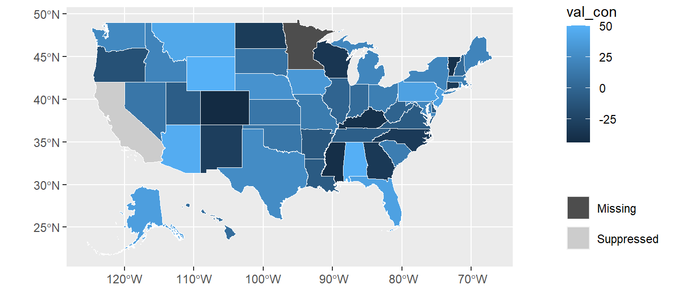
old-style crs object detected; please recreate object with a recent sf::st_crs()
Warning in CPL_crs_from_input(x): GDAL Message 1: CRS EPSG:2163 is deprecated.
Its non-deprecated replacement EPSG:9311 will be used instead. To use the
original CRS, set the OSR_USE_NON_DEPRECATED configuration option to NO.
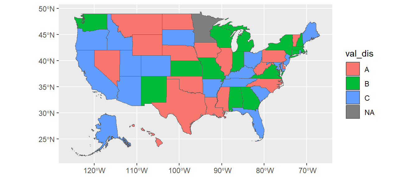
ggplot(states_sf) +geom_sf(aes(fill = val_dis))
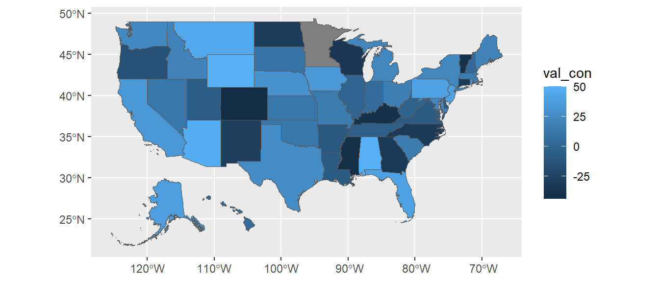
ggplot(states_sf) +geom_sf(aes(fill = val_con))
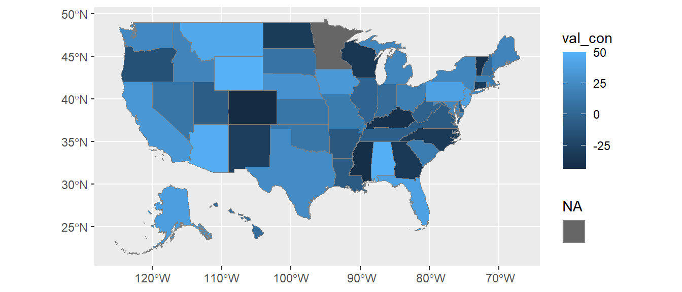
Add NA legend to continuous plot:
ggplot(states_sf) +geom_sf(aes(fill = val_con, color ="")) +scale_fill_continuous(na.value ="grey40") +scale_color_manual(values =NA) +guides(color =guide_legend("NA", override.aes =list(fill ="grey40")) , fill =guide_colorbar(order =1) )
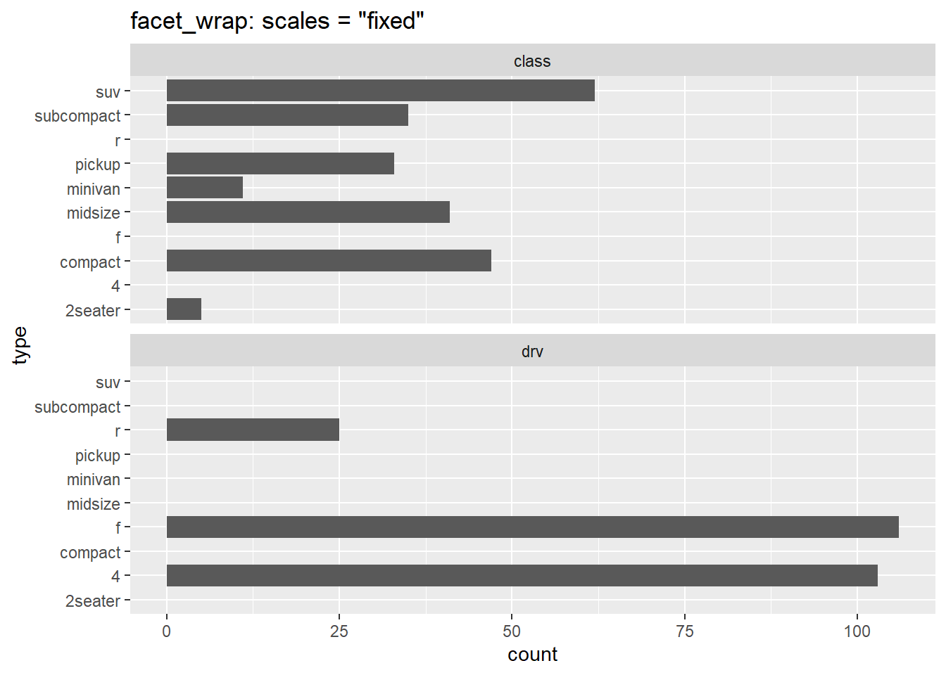
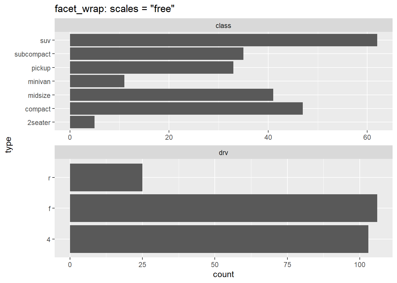
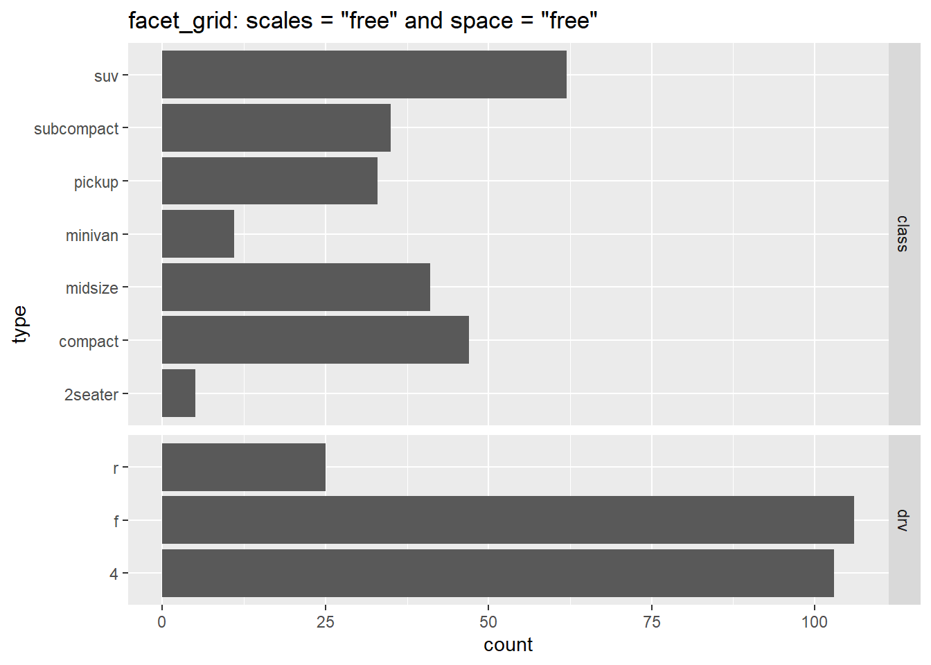
Another option is facet_wrap() or facet_grid(), which can works if the axes are the same for the different variables you want to compare, but be careful as facets are supposed to be comparing items with the same measurements.
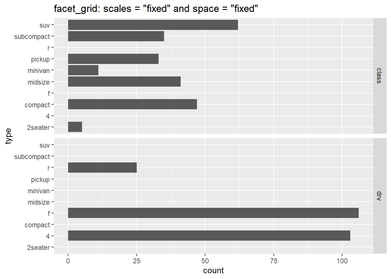
space = "free": spaces based on number of obs (i.e. number of bars); rather than giving each facet equal sizing, ONLY available for facet_grid
ggplot(tidy.df, aes(type)) +geom_bar() +coord_flip() +facet_grid(category ~ ., scales ="fixed" , space ="fixed") +labs(title ='facet_grid: scales = "fixed" and space = "fixed"')ggplot(tidy.df, aes(type)) +geom_bar() +coord_flip() +facet_grid(category ~ ., scales ="free" , space ="free") +labs(title ='facet_grid: scales = "free" and space = "free"')
13.7 Align Axes
Sometimes I’m working on two different types of plots (like a bar chart and a scatter plot) that happen to have the same x-axis. I want to line up these axes so that when the plots are stacked the values correspond to the same date.
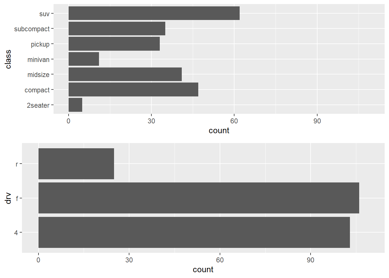
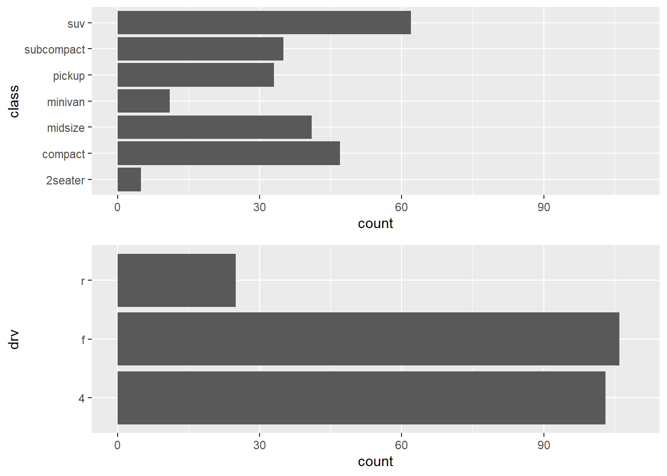
13.7.1gridExtra::grid.arrange() and cowplot::plot_grid()
# two different bar chartsA <-ggplot(mpg, aes(class))+geom_bar()+coord_flip()+ylim(0, 109)B <-ggplot(mpg, aes(drv))+geom_bar()+coord_flip()+ylim(0, 109)
Using grid.arrange command from the gridExtra package does not line up axes.
#axes don't line upgridExtra::grid.arrange(A, B, ncol=1)
Use grid.draw command from the grid package to left align graph edges .
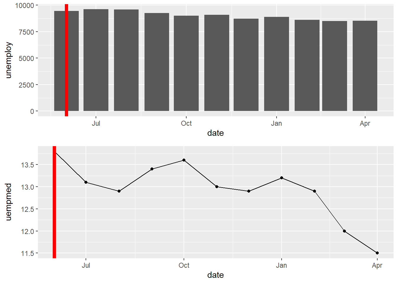
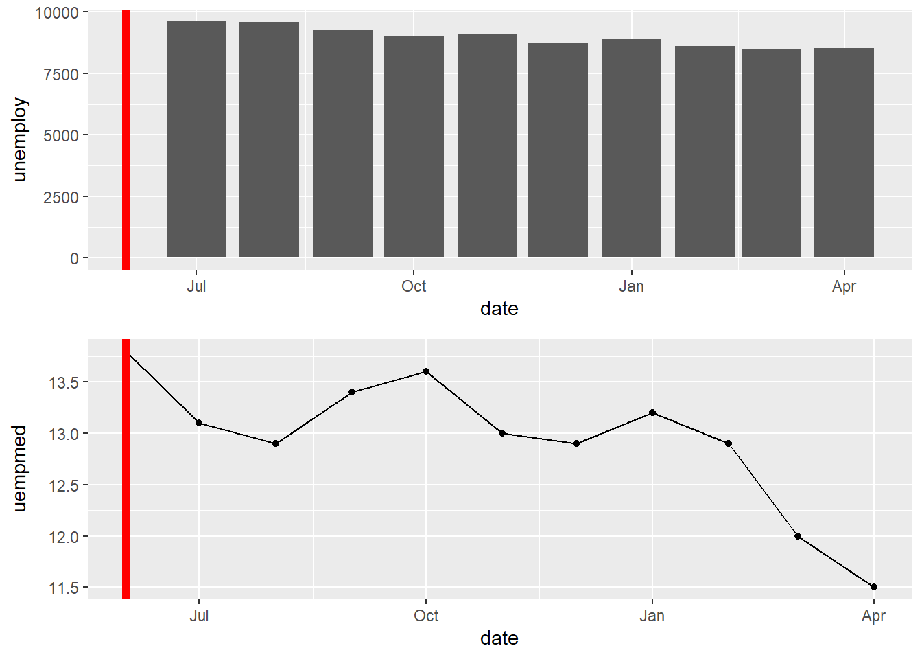
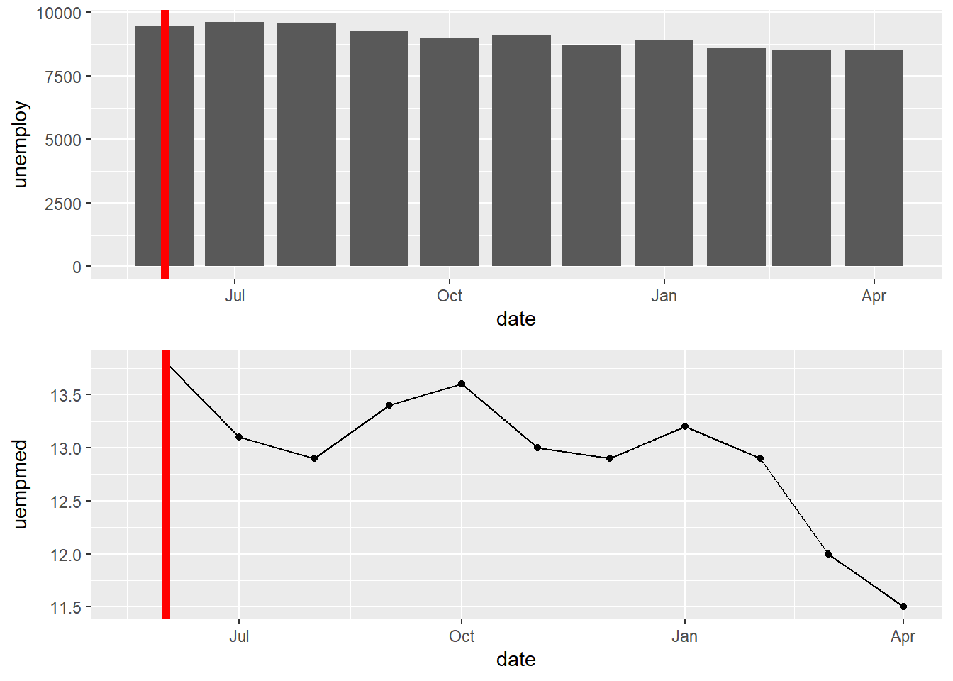
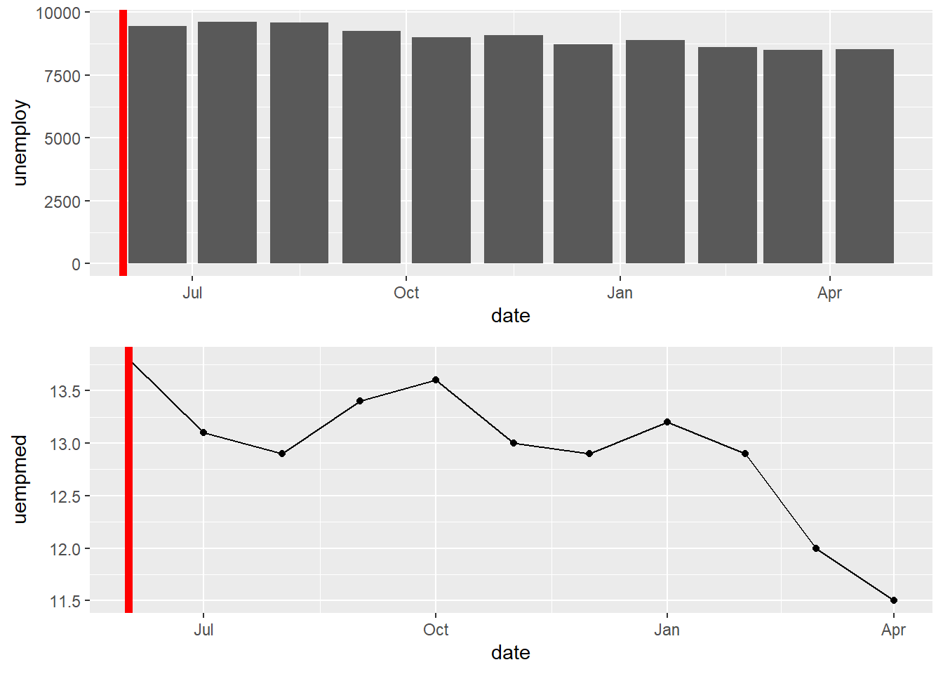
Scatter plots and bar charts will not line up automatically, even when using the grid.draw/plot_grid command detailed above. This is because their default limits are different given that the bar chart is centered on the value and the scatter plot is a single point on the value.
#work with smaller subset of economics (ggplot2)startdate <-"2014-06-01"economics_small <- economics %>%filter(date >=as.Date(startdate)) %>%arrange(date)
A <-ggplot(economics_small, aes(date, unemploy))+geom_bar(stat="identity")+geom_vline(xintercept =as.Date(startdate), color="red", size=2)
Warning: Using `size` aesthetic for lines was deprecated in ggplot2 3.4.0.
ℹ Please use `linewidth` instead.
Warning: Removed 1 row containing missing values or values outside the scale range
(`geom_bar()`).
This can be fixed by adding a half unit to the x-axis (i.e. having the lower limit be half-unit lower than smallest x-value). In this case the unit is a month, so a half-unit would be ~15 days.
Bar charts are automatically centered over the x-value. Bar charts (and any geom object) can be shifted by using position - position_nudge()). The shift needs to be half a unit on the x-axis, again here it is monthly data so a half unit would be ~15 days.