There may be instances where you want to include the geography label as well as another label (such as a value) on the hex map.
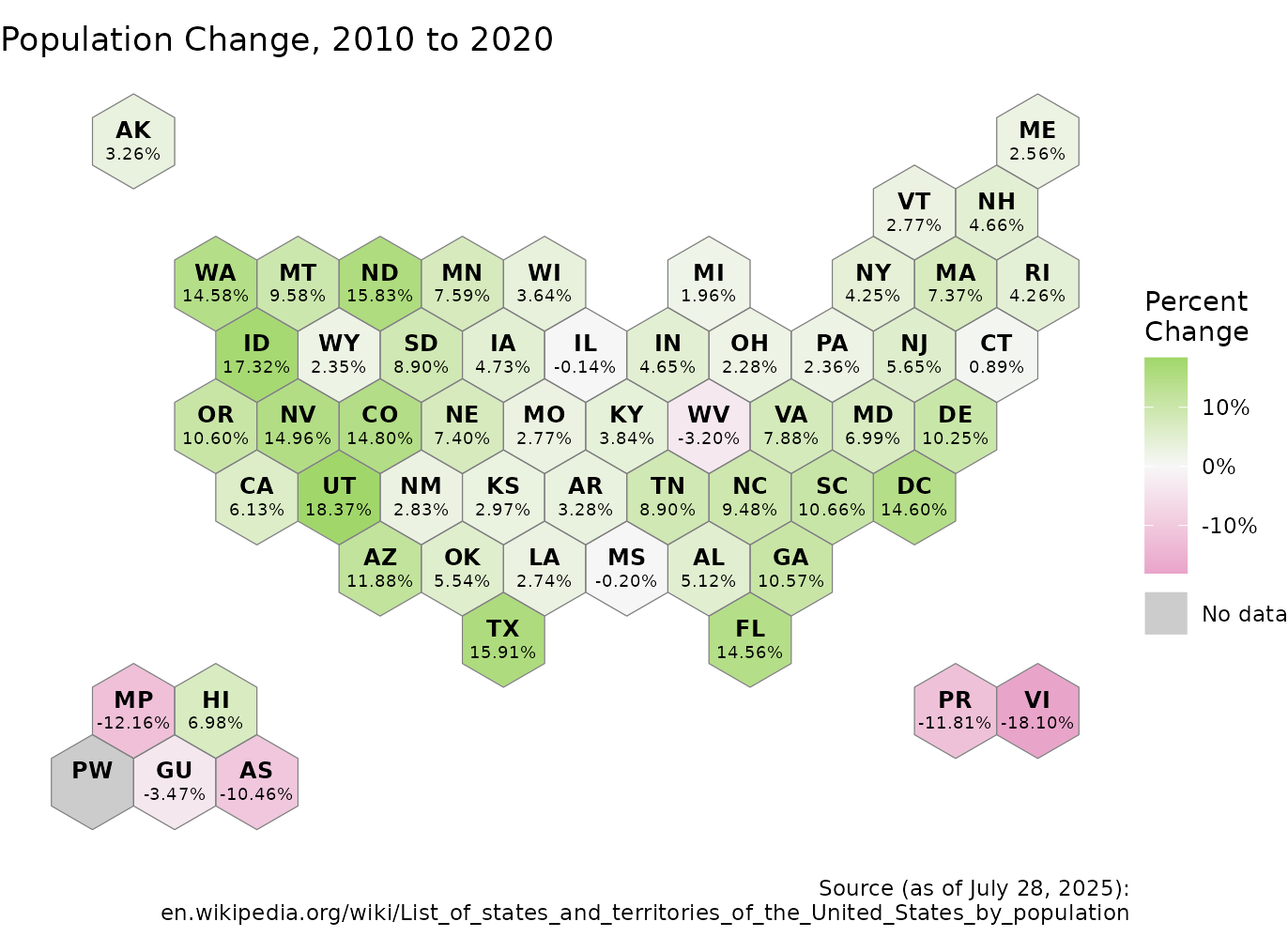
Population Change for the US from 2010 to 2020, pulled from Wikipedia using this code
other_data <- read.csv("https://raw.githubusercontent.com/MarEichler/usahex/refs/heads/main/data-raw/us_population_change_2010_to_2020.csv")

title <- "Population Change, 2010 to 2020"

source <- paste0(
      "Source (as of ",
      format.Date(as.Date("2025-07-28"), '%B %e, %Y'),
      "):\n",
      "en.wikipedia.org/wiki/List_of_states_and_territories_of_the_United_States_by_population"
)
Pull the hexagon coordinates using get_coordinates()
function.
hexmap <- get_coordinates("usaETA", "hexmap")Join the coordinates data with the the population change data.
combined <- left_join(hexmap, other_data, by = "name")Plot data with state label and value label of percentage change in population.
NA_color <- "grey80"
# RColorBrewer::brewer.pal(3, "PiYG")
scale_colors <- c("#E9A3C9", "#F7F7F7", "#A1D76A")

ggplot(combined) +
  geom_sf(aes(fill = perc),     color = NA       ) +  #color (non-NA) hex
  geom_sf(    fill = NA,          aes(color = "NA")    ) +  #dummy for NA values
  geom_sf(    fill = NA,              color = "grey50" ) +  #hex borders
  geom_sf_text(
    data=mutate(combined, geometry=geometry+c(0, 5)) # adj state label up by 5
    , aes(label=abbr_usps)
    , fontface="bold"
    , size=3.25
  ) +
  geom_sf_text(
    data=mutate(combined, geometry=geometry+c(0,-5)) # adj percent label down by 5
    , aes(label=perc_label)
    , size=2.5
  ) +
  scale_fill_gradient2(
    name = "Percent\nChange"
    , low  = scale_colors[1]
    , mid  = scale_colors[2]
    , high = scale_colors[3]
    , midpoint = 0
    , labels = ~sprintf("%1.f%%", .x)
    , na.value = NA_color
  ) +
  scale_color_manual( #dummy legend for NA color
      name = NULL
    , values = NA_color
    , labels = 'No data'
  ) +
  guides(
      fill  = guide_colorbar(order = 1)
    , color = guide_legend(override.aes = list(fill =NA_color))
  ) +
  labs(
    title = title,
    caption = source
  ) +
  theme_void()